Casebrief: Robin Assistant
- Client Robin Assistant
- Code GitHub repo
Robin Assistant
Making healthcare simple and clear
Challenge
Introducing Robin Assistant: innovative software for individuals with
special needs and their caregivers, catering to conditions like
autism, Down syndrome, Alzheimer's, dementia, and brain injuries.
Our challenge? Crafting a conceptual revamped dashboard that works for
healthcare providers and clients, ensuring improved user
experience, clarity, and efficiency in daily tasks.
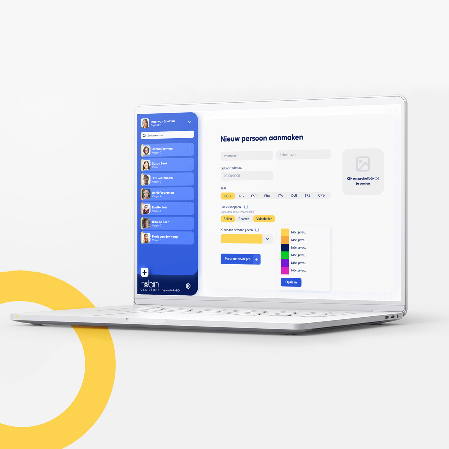
Our brief was on refining 1 aspect of the dashboard, honing the look and feel to perfection within a
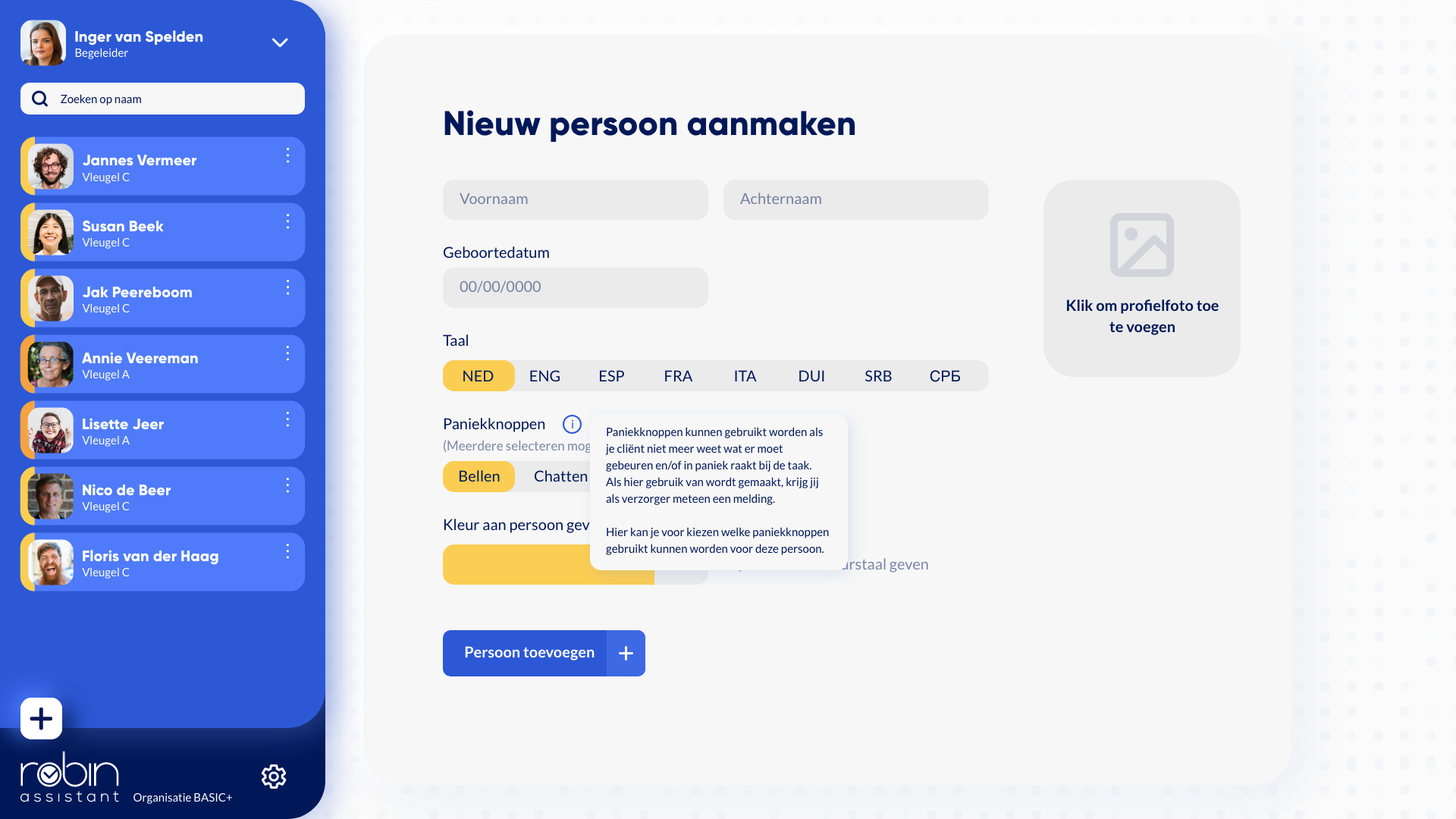
single sprint, in time period of 4 weeks total. We decided to focus on remaking the process of
adding a client into the system, because it marks the beginning of the cycle and required the most
significant makeover.
My part
As part of a collaborative team of four, I assumed the role of UI/UX designer,
closely collaborating with the front-end developer to ensure a delightful user
experience within the dashboard.
Therefore I designed the interactions itself and worked with the Front end dev to
get those interactions feel smooth and enjoyable to use.
Simultaneously, I collaborated with the graphic designer to refine the renewed
branding, ensuring a cohesive and intuitive UI that aligns seamlessly with Robin
Assistant's message.
Key factors in our journey to succes
To ensure the success of this project, our foremost priority was tailoring the dashboard to suit the
needs of the specific target audience.
In this case, clarity was paramount. The dashboard had to deliver a seamless, efficient experience,
prioritizing speed and enjoyment, while also guaranteeing functionality without any potential
hazards.
In addition to these essential requirements, our client sought an updated UI for a more modern and
streamlined look. Our key focus areas were ensuring ease of use, enjoyable interactions, swift
functionality, and a clear, functional flow throughout the dashboard.
A clear and easy to use experience
To achieve an easy, enjoyable, functional, and clear dashboard, we applied key factors to both our
design system and the working product.
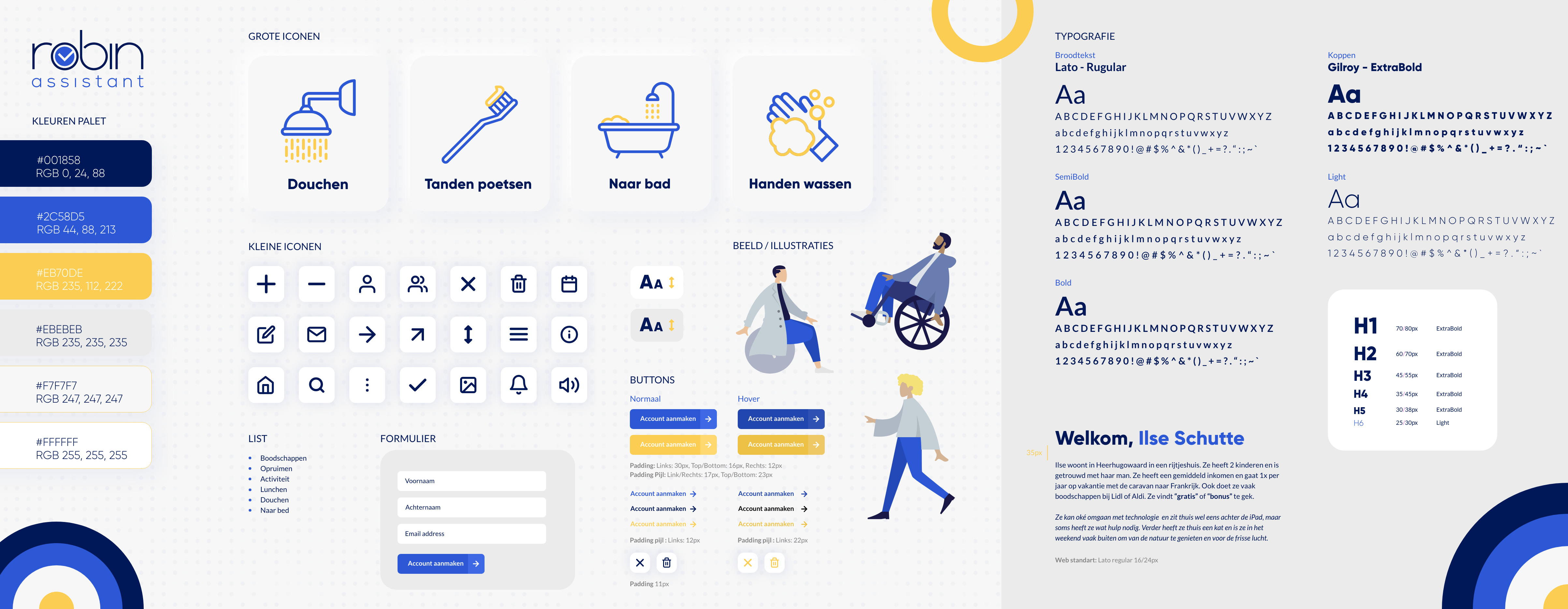
In the design system, our focus was on clarity and reliability, reflected in elements such as our
color palette and font selection. We infused fun into the design by integrating yellow accents with
blue and white, and introducing playful interactions in the branding, evident in buttons and
illustrations.
For clarity in task explanation, we used icons in blue and yellow colors, aiding the client in
distinguishing between task elements - the object and the objective - for step-by-step tasks.
Interactive pleasure
In our approach, we aimed to infuse the caretakers' and clients' environment with a sense of fun and
playfulness. Rather than creating a mundane, commercial dashboard, we strived for a user experience
that brings smiles to the faces of those who are in healthcare services.
To achieve this, we made clients feel appreciated and valued by incorporating playful and slightly
goofy illustrations that represent them, evident in elements like the loading screen animation.
Similarly, for caretakers who interact with both clients and the dashboard, we aimed to personalize
the experience, making it feel more engaging and relatable.


Building the dashboard
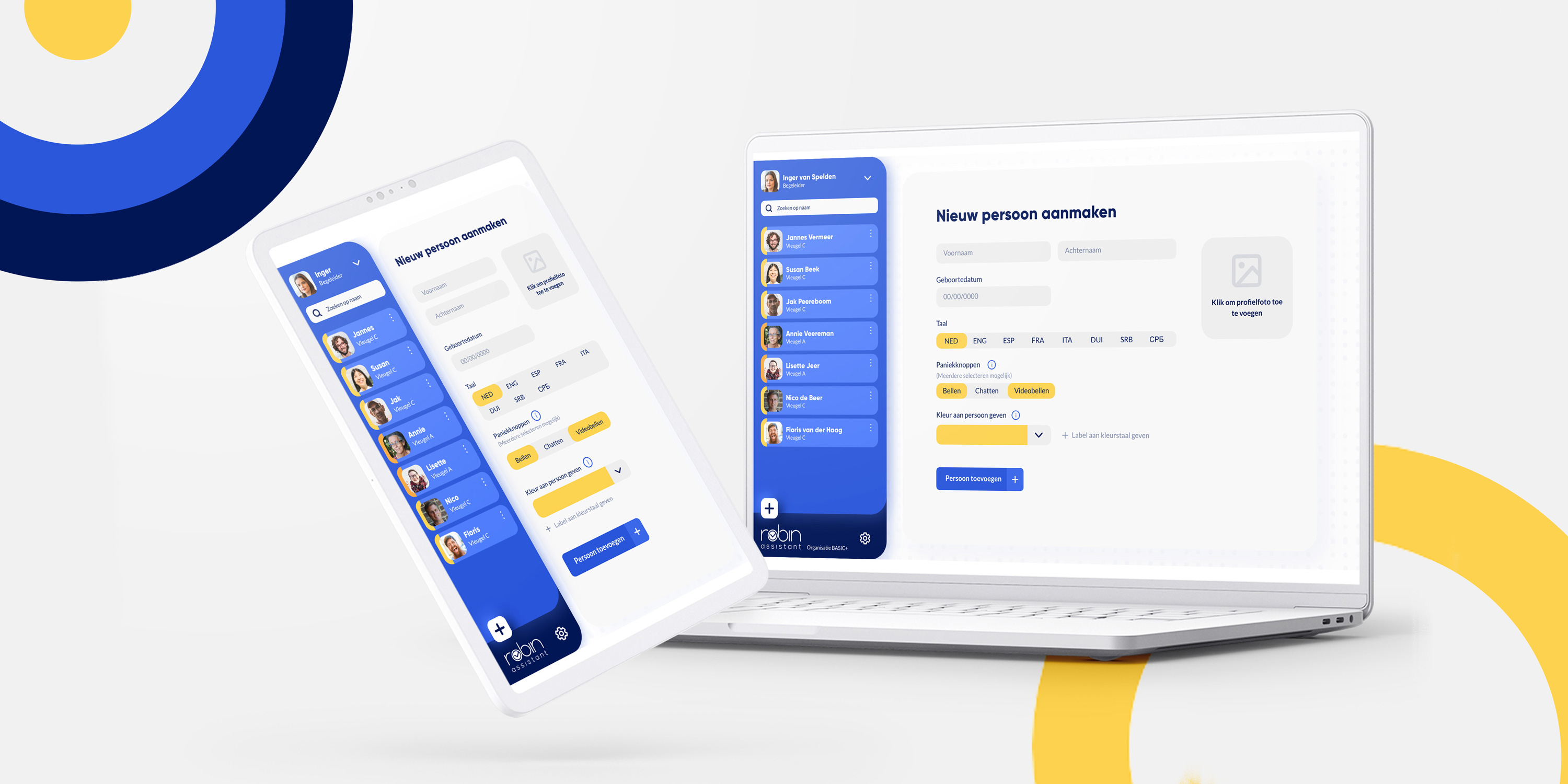
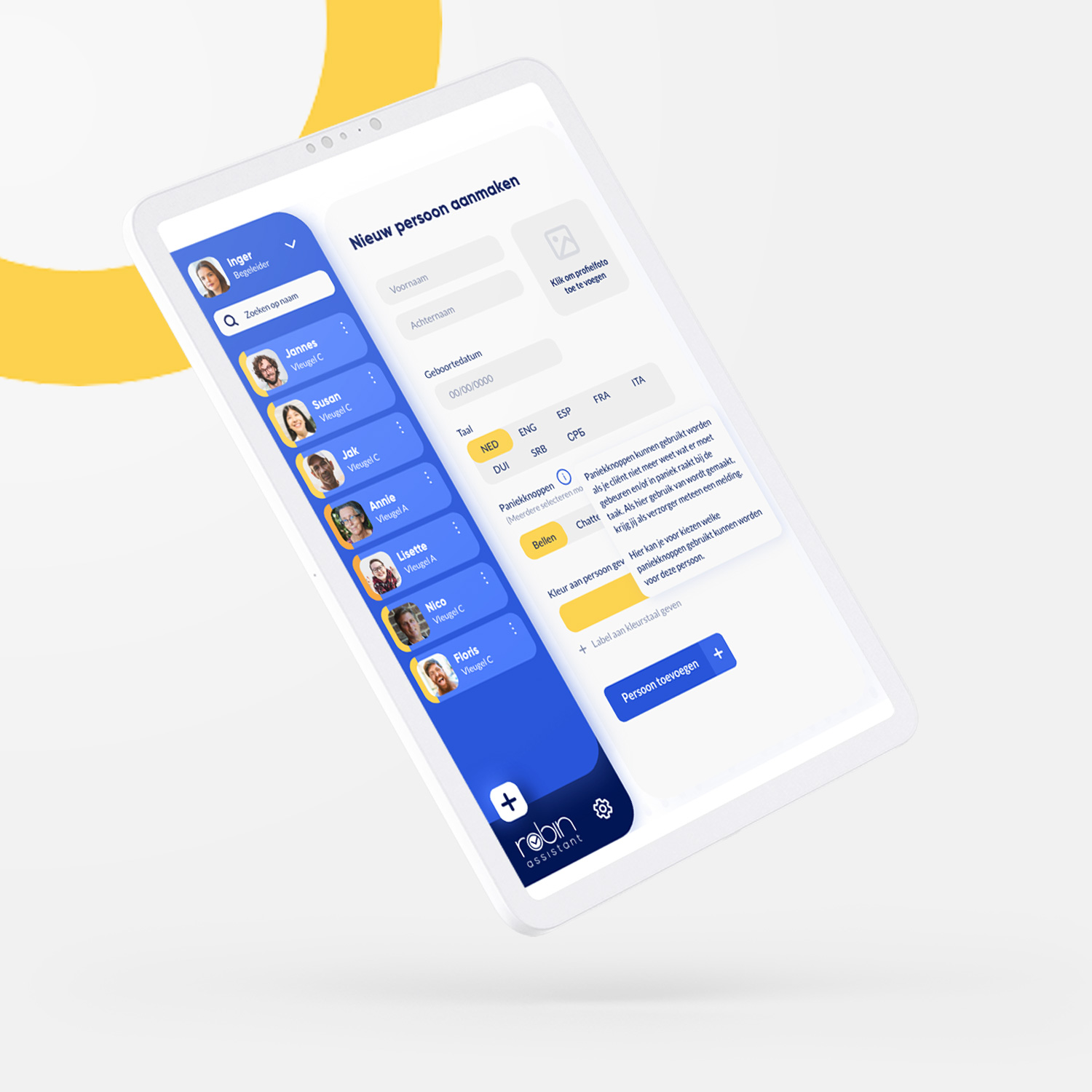
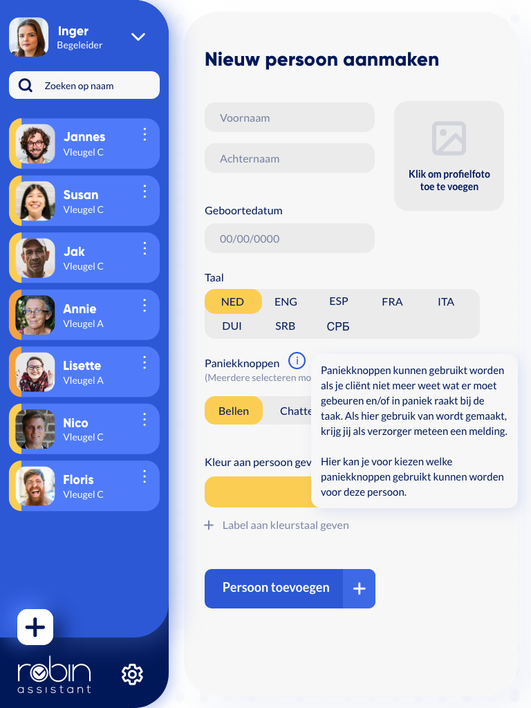
Ensuring responsiveness was crucial as the dashboard would be used on both iPads and desktops. This
required crafting different layouts for various screen types while ensuring efficiency and
memorability for users.
Collaborating closely with the front-end developer, we made choices aligned with our key factors.
The primary challenge was creating an interface on iPads that was as efficient as on desktops.
Ultimately, we succeeded in designing a layout that resonated with our vision and provided a smooth
user experience on both devices
Making the expierence
Throughout the dashboard development process, the collaboration between myself and the front-end
developer was marked by teamwork and practical problem-solving.
We coordinated efforts, especially in areas like implementing interactions and ensuring
responsiveness.
I offered support by providing alternative design solutions and insights into user behavior.
Together, we tackled challenges such as optimizing performance and integrating animations.
Our collaborative approach ensured that the dashboard met both design goals and technical
requirements, resulting in a smooth user experience.
Want to see some more?
Yeti Motion
Front End